Encoding animated point map
During the latest World Cup you might have seen some animated maps with tweets around the world showing different colors depending the team people were talking about. Yes, the maps that look like a fireworks. Those maps are done using torque, a technology we developed at CartoDB. In this post I want to talk about how we encode the data that goes into the animation.
a little bit of history
Torque had a start a few years ago in a project where we needed to show the process of deforestation over time. If you imagine the standard web map, a bunch of tiles (generally PNG images) representing a portion of the earth, rendered on the server and put back in order on the client to show a seamless map. Static images are great, but don’t help much when you want to show changes over time. On top of showing change, we wanted to style the data dynamically and let our users control the playback.
At the time, the HTML5 canvas element was something new and not used by any major mapping library. We explored the concept of sending raw data to the client and rendering that data on the fly on canvas. What we found very early in the project was that rendering the data was easy (well, “easy”), generating and transfering the data was the hard part.
torque data format
Torque format is pretty simple. Each tile is an array of points and each point has two arrays, one for the time dimension and another for a variable, in our case intensity of deforestation at that point in time. Now in CartoDB, it takes a generic form where the value is set by the user.
  [
    {
      x__uint8: 8, // webmercator snapped to tile pixel
      y__uint8: 10,
      date__uint16: [0, 10, 45, 46] // steps * floor( (date - min_date)/(max_date - min_date) )
      vals__uint8: [1, 3, 5, 10],   // values for steps aggregated
    },
    ...
  ]
So lets say that we are showing tweets for a day interval. In this example, at point 8, 10 for date 0 the number of tweets would be 1, for date 10 the tweets would be 3, and so on.
This format was proposed by Andrew Hill and there is a nice presentation about it. He got the idea from datacubes and the nice thing about it is that you can use the same XYZ tile system as static image tiles and you can generate the values for each tile with a single SQL API query.
The objective of this post is not explain in detail torque format (which is actually an on going task). Instead, I’d like to focus on how we encode the data in Torque tiles.
encoding torque tile
A core challenge to most web development is to show the user content as quickly as possible when they load the page. This is the same for making maps on the web. For Torque tiles, this means we needed to focus on both transfer size and how to encode the data as quickly and efficiently as possible.
The first step for us was to find clever ways to omit information that will not be visualized. Like TopoJSON the coordinates and dates are quantified, the values are aggreagated and all is encoded as integers. Integer arrays greatly improve the performance of compression for data transfer. Removing anything more puts us at risk of reducing visualization quality.
So next, we looked at how to arrange and encode data in each tile in order to improve the compression ration.
To understand our solution, let’s get 2 different datasets and we’ll try to re-arrange them for improvements. The first one is global tweets from a world cup match (1.3M points), the second one is a dataset of ship positions during the second world war (800k points). They are pretty different as we will see later.
The torque tile (0, 0, 0) size is:
tweets: 854kb, 197kb, 76% gzip compressed ratio
ships:  345kb, 60kb,  83% gzip compressed ratio
The compression ratio is pretty good (around 77%) but it can be improved
delta encoding
I’m a big fan of PNG encoding and the way it prepares the data (called the ‘filter step’ in the spec) to extract all the redundancy is pretty smart: simple, fast and very effective. In short, it computes the difference between adjacent pixels and then compresses the calculated values instead of the original data.
In the Torque format, dates are arranged in the array from earliest to latest and so always grow! These are perfect for Delta Encoding, and the compression ratio should obviously improve. Let’s see,
tweets: 854kb, 132kb, 84% (+8%)
ships:  345kb, 60kb,  83% (=)
In tweets we improve 8% but in ships dataset stay the same, why? let see an histogram of non-encodes dates values vs encoded values.
For tweets dataset:

For ships dataset:
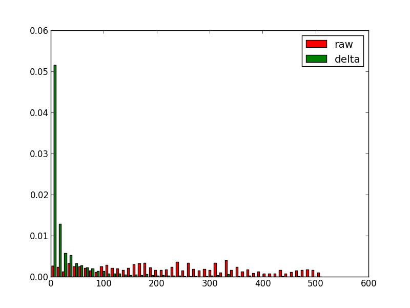
It’s clear that for tweets the date step is uniform so the delta works pretty well but for ships dataset altough there are symbols with higher frequency (around 0) there are still lot of them. Normally torque datasets are more like ships datasets in term of dates.
arrange things
The gzip compression algorithm works by looking for similar adjacent strings, so we can gain further improvements if we can arrange our data so like are near like. In our torque tile we could switch from an array of objects to a single object with different arrays,
  {
    x__uint8: [............],
    y__uint8: [............],
    vals__uint8: [............],
    dates__uint16 : [............],
  }
the results for this are:
tweets: 854kb, 119kb, 86% (+10%)
ships:  345kb, 48kb,  86%, (+3%)
I tried some variations of this:
- sorting pixels in different order. No interesting change
- delta encoding pixels, dates and values (+1% ships datasets)
arrange data by step
what happens if we reorder the data in a totally different way. Instead of storing the data by coordinate, if the data is aggregated by time step, like:
  {
    0: {
      x__uint8: [............],
      y__uint8: [............],
      vals__uint8: [............],
    },
    1: {...}
  }
the results:
tweets: 854kb, 329kb, 61% (-15%)
ships:  345kb, 50kb,  85%, (+3%)
Some surprises here, for first dataset the compression if far worse but for the second one it improves (but it’s not the best). So looks like depending on the data we can find different optimal arrangements.
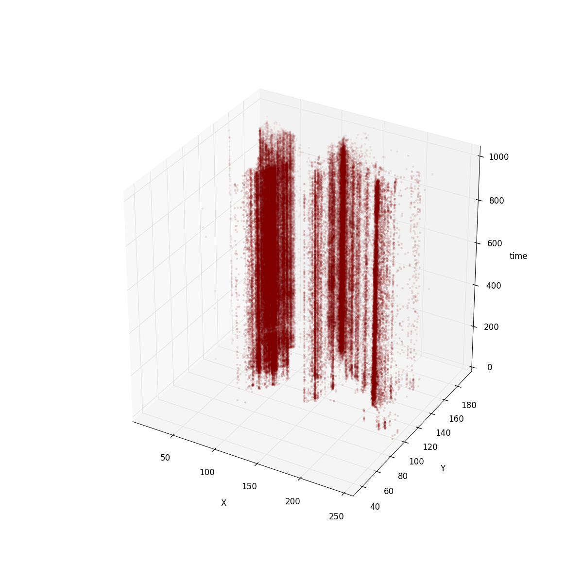
In order to understand this I plot the torque tile using a 3D graph.
For the tweets tile this is how it looks like:
for ships:
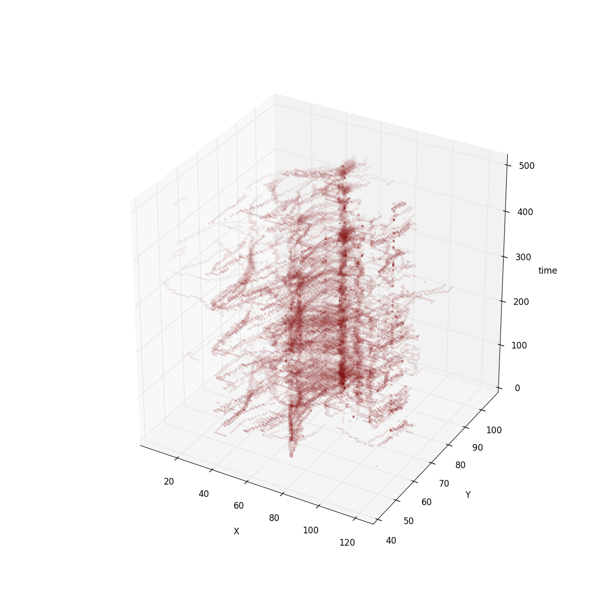
It’s clear that in tweets dataset the positions are more or less immutable. So encoding positions as keys is a good way to avoid duplicated data. For ships dataset the positions are not as fixed. However, if you imagine ships moving around the world, coordinates are follow an animated path, so delta encoding has a strong effect.
Although for the tweets dataset our compression ratio got worse with our last attempt it has other properties that make it appealing as our internal format.
-
This is the format the renderer uses internally for rendering so less time will be spent decoding and less intermediate memory used
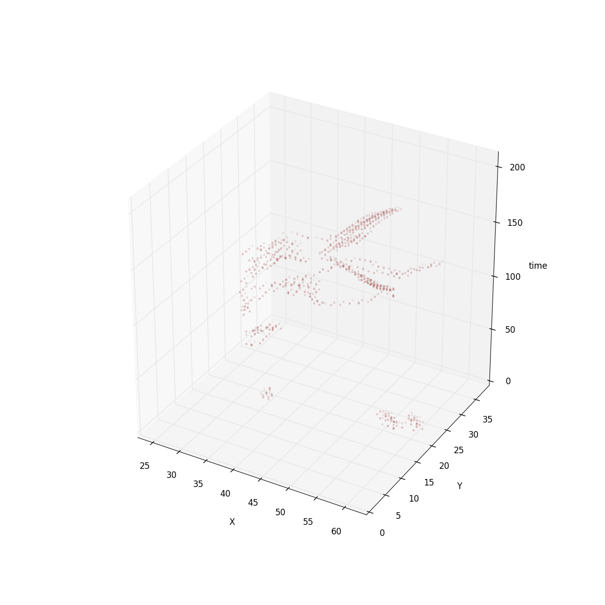
Like I said, I’m a big fan of PNG approach. Some of the existing filtering techniques could still be applied to the Torque format. Especially if Torque is storing animated raster datasets filters like paeth could work between time slots. Take a look to the 3D view of this “animated raster dataset”:
- Finaly, the PNG interlacing approach makes sense here. The way it works is using subdivision and could be used exactly in the same way for quadtree tiles.
try torque.js. You can find the data and the source code for the analysis in my github account