javisantana.com
El precio de una vida
Esta semana el gobierno español ha decidido traer a Miguel Pajares, un cura que estaba ayudando en África, contiagiado de ébola para ver si podían sacarlo del agujero.
El espectáculo ha sido lamentable pero esta vez no hablo del gobierno, he leído desde gente quejándose por el dinero hasta gente con miedo por si provocaba una epidemia de proporciones bíblicas.
Hace unos años, estando yo en cuarto de carrera, en una clase de economía, el profesor enunció un problema tal que así:
Cual es coste máximo admisible para la instalación de un semáforo en un cruce donde moría 1 persona al año.
Tuve la mala suerte de que me tocase a mi resolverlo en la pizarra y mi respuesta básicamente fue poco económica: “se pone sí o sí”. Lógicamente esa no era una respuesta válida en una clase de econonomía, así que me pasé unos minutos en la pizarra tratando de hacer cuentas que no me llevaban a ninguna parte.
Todo hasta que el profesor me dio una pista: la vida humana se valoraba en unos 10.000€, jústamente la equis que quedaba por despejar.
Dejando a un lado el problema, aquella situación me dejó marcado ¿Cómo alquien podría atreverse a poner precio a una vida humana? aunque fuese en una clase de economía en un desafortunado ejemplo.
En el tema del cura (que parece que era lo único importante aquí), que por desgracia ha muerto hoy, prefiero no tener opinión, prefiero no tener que sufrir la idea de ponerme en el pellejo del gestor o de la familia del hombre (*). Parece que otra gente no tiene tantos problemas en debatir alegremente cuando se habla de una vida.
(*) hace ya nos años que trato de no pensar mucho en el otro barrio
Encoding Point Map Animations
Encoding animated point map
During the latest World Cup you might have seen some animated maps with tweets around the world showing different colors depending the team people were talking about. Yes, the maps that look like a fireworks. Those maps are done using torque, a technology we developed at CartoDB. In this post I want to talk about how we encode the data that goes into the animation.
a little bit of history
Torque had a start a few years ago in a project where we needed to show the process of deforestation over time. If you imagine the standard web map, a bunch of tiles (generally PNG images) representing a portion of the earth, rendered on the server and put back in order on the client to show a seamless map. Static images are great, but don’t help much when you want to show changes over time. On top of showing change, we wanted to style the data dynamically and let our users control the playback.
At the time, the HTML5 canvas element was something new and not used by any major mapping library. We explored the concept of sending raw data to the client and rendering that data on the fly on canvas. What we found very early in the project was that rendering the data was easy (well, “easy”), generating and transfering the data was the hard part.
torque data format
Torque format is pretty simple. Each tile is an array of points and each point has two arrays, one for the time dimension and another for a variable, in our case intensity of deforestation at that point in time. Now in CartoDB, it takes a generic form where the value is set by the user.
  [
    {
      x__uint8: 8, // webmercator snapped to tile pixel
      y__uint8: 10,
      date__uint16: [0, 10, 45, 46] // steps * floor( (date - min_date)/(max_date - min_date) )
      vals__uint8: [1, 3, 5, 10],   // values for steps aggregated
    },
    ...
  ]
So lets say that we are showing tweets for a day interval. In this example, at point 8, 10 for date 0 the number of tweets would be 1, for date 10 the tweets would be 3, and so on.
This format was proposed by Andrew Hill and there is a nice presentation about it. He got the idea from datacubes and the nice thing about it is that you can use the same XYZ tile system as static image tiles and you can generate the values for each tile with a single SQL API query.
The objective of this post is not explain in detail torque format (which is actually an on going task). Instead, I’d like to focus on how we encode the data in Torque tiles.
encoding torque tile
A core challenge to most web development is to show the user content as quickly as possible when they load the page. This is the same for making maps on the web. For Torque tiles, this means we needed to focus on both transfer size and how to encode the data as quickly and efficiently as possible.
The first step for us was to find clever ways to omit information that will not be visualized. Like TopoJSON the coordinates and dates are quantified, the values are aggreagated and all is encoded as integers. Integer arrays greatly improve the performance of compression for data transfer. Removing anything more puts us at risk of reducing visualization quality.
So next, we looked at how to arrange and encode data in each tile in order to improve the compression ration.
To understand our solution, let’s get 2 different datasets and we’ll try to re-arrange them for improvements. The first one is global tweets from a world cup match (1.3M points), the second one is a dataset of ship positions during the second world war (800k points). They are pretty different as we will see later.
The torque tile (0, 0, 0) size is:
tweets: 854kb, 197kb, 76% gzip compressed ratio
ships:  345kb, 60kb,  83% gzip compressed ratio
The compression ratio is pretty good (around 77%) but it can be improved
delta encoding
I’m a big fan of PNG encoding and the way it prepares the data (called the ‘filter step’ in the spec) to extract all the redundancy is pretty smart: simple, fast and very effective. In short, it computes the difference between adjacent pixels and then compresses the calculated values instead of the original data.
In the Torque format, dates are arranged in the array from earliest to latest and so always grow! These are perfect for Delta Encoding, and the compression ratio should obviously improve. Let’s see,
tweets: 854kb, 132kb, 84% (+8%)
ships:  345kb, 60kb,  83% (=)
In tweets we improve 8% but in ships dataset stay the same, why? let see an histogram of non-encodes dates values vs encoded values.
For tweets dataset:

For ships dataset:
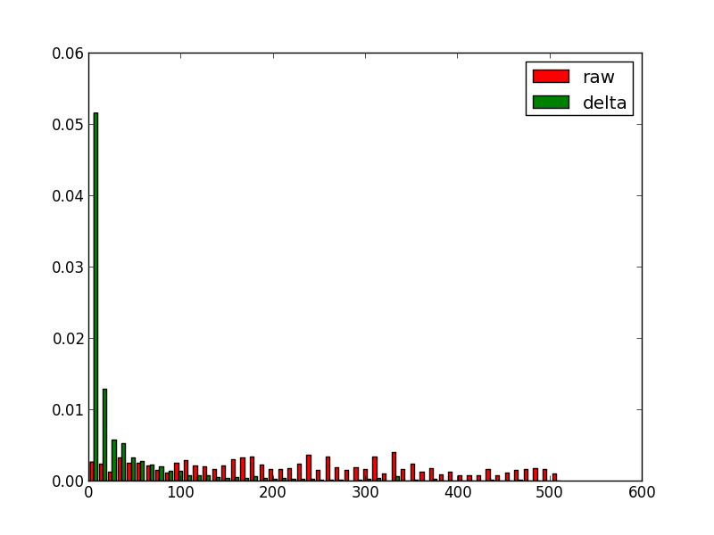
It’s clear that for tweets the date step is uniform so the delta works pretty well but for ships dataset altough there are symbols with higher frequency (around 0) there are still lot of them. Normally torque datasets are more like ships datasets in term of dates.
arrange things
The gzip compression algorithm works by looking for similar adjacent strings, so we can gain further improvements if we can arrange our data so like are near like. In our torque tile we could switch from an array of objects to a single object with different arrays,
  {
    x__uint8: [............],
    y__uint8: [............],
    vals__uint8: [............],
    dates__uint16 : [............],
  }
the results for this are:
tweets: 854kb, 119kb, 86% (+10%)
ships:  345kb, 48kb,  86%, (+3%)
I tried some variations of this:
- sorting pixels in different order. No interesting change
- delta encoding pixels, dates and values (+1% ships datasets)
arrange data by step
what happens if we reorder the data in a totally different way. Instead of storing the data by coordinate, if the data is aggregated by time step, like:
  {
    0: {
      x__uint8: [............],
      y__uint8: [............],
      vals__uint8: [............],
    },
    1: {...}
  }
the results:
tweets: 854kb, 329kb, 61% (-15%)
ships:  345kb, 50kb,  85%, (+3%)
Some surprises here, for first dataset the compression if far worse but for the second one it improves (but it’s not the best). So looks like depending on the data we can find different optimal arrangements.
In order to understand this I plot the torque tile using a 3D graph.
For the tweets tile this is how it looks like:
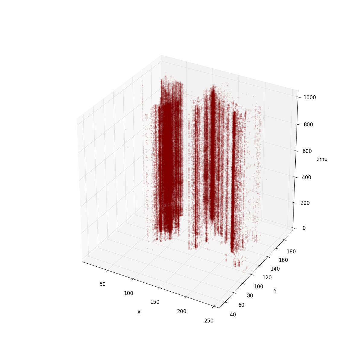
for ships:
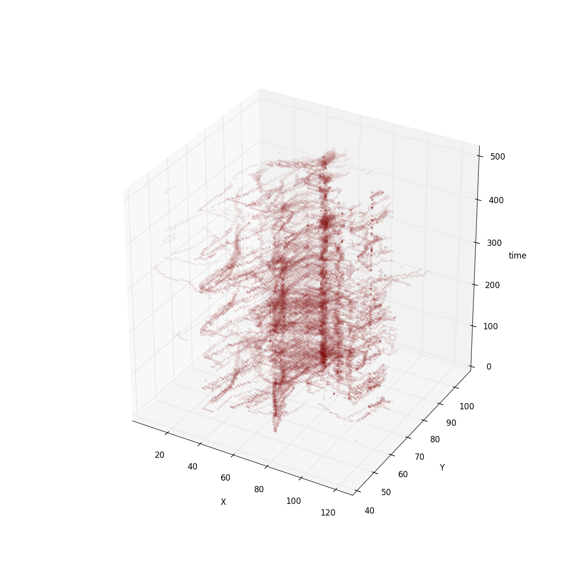
It’s clear that in tweets dataset the positions are more or less immutable. So encoding positions as keys is a good way to avoid duplicated data. For ships dataset the positions are not as fixed. However, if you imagine ships moving around the world, coordinates are follow an animated path, so delta encoding has a strong effect.
Although for the tweets dataset our compression ratio got worse with our last attempt it has other properties that make it appealing as our internal format.
-
This is the format the renderer uses internally for rendering so less time will be spent decoding and less intermediate memory used
Like I said, I’m a big fan of PNG approach. Some of the existing filtering techniques could still be applied to the Torque format. Especially if Torque is storing animated raster datasets filters like paeth could work between time slots. Take a look to the 3D view of this “animated raster dataset”:
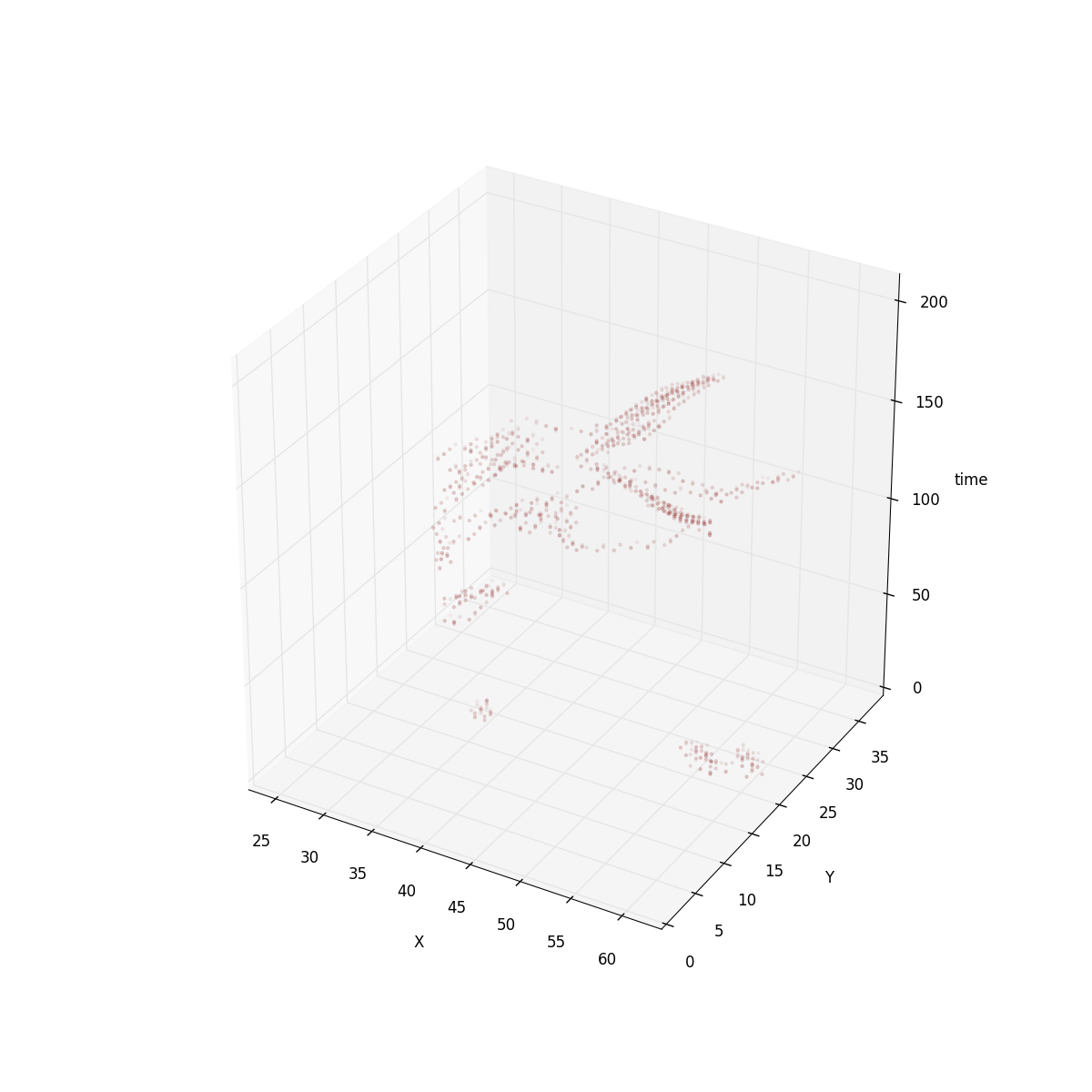
- Finaly, the PNG interlacing approach makes sense here. The way it works is using subdivision and could be used exactly in the same way for quadtree tiles.
try torque.js. You can find the data and the source code for the analysis in my github account
Lanzamos Agroguia Tracker
Lanzamos agroguía tracker
Esta semana hemos lanzado Agroguía tracker, una aplicación para móviles que permite al agricultor llevar toda la gestión de los trabajos que realiza en sus parcelas con GPS. Si no lo conoces, Agroguía (a secas) es una herramienta que gracias al GPS ayuda al guiado durante las labores que realizan los agricultores. Es una herramienta que desarrollamos y vendemos hace ya 8 años.
Este post no es más que un pequeño resumen del cómo y el porqué (y de paso hacer un poco de SEO).
Hace unos 6 años aproximadamente una mañana de sábado se me ocurrió que sería buena idea que los agricultores pudiesen revisar su trabajo una vez llegasen a casa. La idea evolucionó cuando vi a algunos agricultores usar esa capacidad de Agroguía para llevar la cuenta de dónde habían ido y qué había hecho. Algo tan simple como eso se puede convertir en un infierno si tienes más de 50 parcelas como tienen algunos de nuestros clientes.
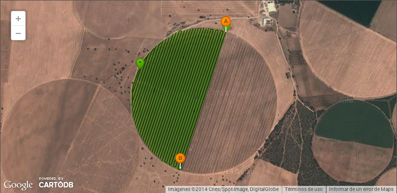
La última versión más o menos grande de Agroguía fue hace 2 años, en ella decidimos incluir una funcionalidad que, igual que strava o runkeeper, envía un informe del trabajo realizado por el agricultor a su correo para analizaro, llevar la cuenta o símplemente ver alguna nota. A día de hoy tenemos miles de trabajos y muchos agricultores que han abandonado ya el cuaderno y lápiz que llevaban en el tractor. Aquí uno de los trabajos donde se trata solo la parte que riega el pivot:
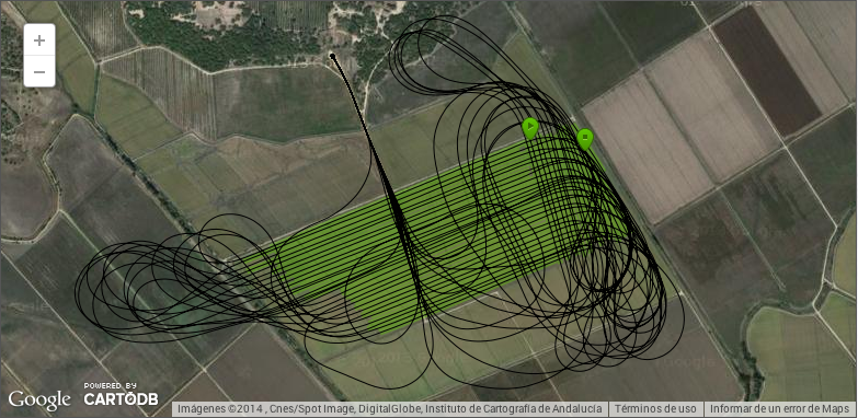
o este otro donde se ve como trabaja un avión. He dicho que tenemos una versión especial de guiado GPS para aviones y helicópteros?
Durante este tiempo hemos recibido muchas llamadas interesadas exclusivamente en esa funcionalidad (que dicho de paso es totalmente secundaria) así que pensamos que sería una buena idea sacar un subproducto de forma que pudiesemos vender eso por separado. Otra de las razones para hacer esto es intentar llegar a zonas donde antes no llegabamos, por ejemplo cosechadoras y empacadoras, que precisamente funcionan durante los periodos donde la venta de Agroguía baja mucho. En realidad hay otras cuantas razones más, pero esas mejor las cuento en persona.
El desarrollo ha sido bastante intermitente, de hecho la idea era lanzarlo a principios de mayo para hacer la campaña de mailing y demás antes de que empezase la cosecha, pero hemos llegado un pelín tarde y la aplicación tiene todo lo que me hubiese gustado, pero siempre es mejor ir haciendo basándose en lo que te van diciendo que sacar la bola de cristal como bien dicen en “Getting real” (el libro de cuando los de 37signals no estaban podridos de pasta y que de verdad es un must read). La aplicación no tiene ni nombre, pero tampoco importa ahora demasiado, no hemos venido aquí a lucir palmito, estamos tratando de resolver un problema real y ganar dinero (y hacerlo ganar) con ello. Probablemente ver como alguien resuelve un problema del mundo real con algo que tú has desarrollado es de las cosas que más llenan como programador.
Lo siguiente será ver como la gente reacciona, hemos tratado de enforcarlo como una herramienta de GPS para cosechadoras, pero en realidad es una herramienta que permite construir aplicaciones orientadas a casi cualquier cosa del ámbito agrícola, así que posiblemente vayamos usándola a lo largo del año para otros menesteres. Es algo bastante nuevo, así que seguramente habrá mucho trabajo de explicar qué es y cómo funciona, lo mismo que hicimos hace 8 años con el guiado GPS.
Como curiosidad, la tecnología que hace que todo esto funcione va a hacer 9 años, para que luego digan que hacer un buen diseño técnico no merece la pena.
Testing
Testing
Ahora que se ha pasado un poco la tormenda de TDD is dead y cada uno ha podido buscar las armas y posicionarse de bando que más le convenía creo que es el momento de que podamos hablar de testing en el mundo real.
Antes de explicar cual es mi aproximación para hacer testing automático está bien que explique qué significa para mi:
Odio el testing, testear es un mal necesario, si pudiese no testearía, cuando hago algo personal no testeo, ni se me pasa por la cabeza joderme la vida pensando en testear cuando estoy disfrutando programando algo que quiero ver cuanto antes. Odio todo lo relacionado con el testing y sobretodo odio que la gente centre toda la atención en el testing, como si el testing por si solo sirviese de algo.
Pero el testing es necesario. Es como ir a comer con tus suegros (*), sabes que si no lo haces va a ser mucho peor. Puede que en algún proyecto corto merezca la pena no hacerlo, pero en general habría que estar muy tocado para no hacerlo y tener una suite de test que te permita estar un poco más seguro, sobretodo a largo plazo.
Dicho esto, mi política para hacer tests es:
-
Si puedo hago solo test de integración: intento hacer mocks de los extremos y testeo la máxima parte del stack posible. Por ejemplo, si tengo que testear un diálogo (html + javascript) creo el diálogo con los modelos adecuados y lanzo los eventos que lanzaría el usuario y hago checks del UI y de lo que debería tener el servidor/modelo. Como anecdota, el backend de la app que estuvo un día en portada de google tenía 25 tests que cubrían casi todos los casos. Es posible que estés testeando la misma cosa varias veces, se puede vivir con ello sin problema.
-
Casi-nunca hago el test antes. Sinceramente, a mi hacer el test antes no me dice nada del diseño, como mucho me dice si se me ha olvidado algún parámetro, pero de ahí a que la arquitectura emerja va un paso. Cuando programo algo ya tengo en la cabeza lo que debe hacer a alto nivel, los detalles de implementación no son el diseño amigos (aunque nos lo vendan así).
-
Sólo hago el test antes cuando voy a resolver un bug. Ya sabéis, RED -> FIX -> GREEN. Si puedo añadir un assert más a un test que ya existe lo hago, aunque no todos los bugs permiten hacer esto.
-
Solo hago unit test (que muchas veces no lo son) para cosas concretas en las que quiero testear edge-cases de cosas concretas o partes muy críticas.
-
No hago TDD. Lo intenté en su día (hace unos 8 años) y sería por mi poca experiencia, que no le puse mucho empeño, pero no lo vi claro o lo mismo es que ya odiaba el testing.
-
Intento usar los menos fuegos artificiales posibles para hacer los assert, esto es, todo el syntactic sugar que te dan frameworks como jasmine está muy bien, pero casi siempre sobra. Con un assert el 90% de las veces es mucho más que suficiente. Esto lo aprendes tras usarlos a muerte, actualizar la versión de jasmine (o tu sistema de testing favorito) y ver que lo han cambiado porque era mucho más guay.
-
A veces hago tests que varían en función de la máquina o que dependen de servicios externos. A veces merece la pena aunque terminan por machacar el sistema de integración continua.
(*) pongo el ejemplo de los suegros pero puedes poner ahí otro tópico cualquier, esta afirmación no representa de ninguna forma mi experiencia personal y espero que quieras muchísimo a tus suegros. Si eres suegro espero que no dejes de querer a tu yerno/nuera.
Gps App Programming
GPS app programming
I’ve been working with apps that use GPS since 8 years. I’m not an expert on that mather, I’m far to know all the stuff related to high precision GPS, post processing, RTK, how a GPS works internally and so on. In any case there are a bunch of tips from the app programmer point of view you may find useful.
First of all, if you are going to create an app that needs to measure things forget to use any kind of internal GPS. I don’t recommend it since the error is really big even with clear sky view (no obstacles). Those GPS are very good in saving battery, adquiring singal pretty fast but that’s all.
So the tips, most of them from the development of agroguia, a GPS guidance system for farmers and flatout, a timing app for race cars.
Save all the data so you can reproduce it in a emulator with exactly the same timing. So save the timestamp GPS provides and, very recommended, the time the GPS gives you the information. I usually save the tick when the info was processed so the steps can be reproduced exactly in the same way they happened (this will save you hours of debugging)
GPS position information comes from the real world. And in the real world there is noise so forget about the good data you usually get from a JSON API. You need to know basic stuff about signal processing: filters, hysteresis, extrapolation, interpolation and so on. And please, please, use relative coordinates and time to interpolate.
For example, it’s pretty common to get 25 meters jumps and it’s clear that a bike can’t do 25 meters/s (in normal conditions) so if you are coding a strava like app, take that into account. Use domain information to fix those errors. You even can improve that more using some statistics.
Store your data properly: Use a standard format, SHP, GeoJSON, CSV, whatever but it should be easily readable by GIS apps, you don’t want to create your own applications for that. I use CartoDB to analize the data and before CartoDB I had my own tools (that’s why I know how horrible is to do it on your own) and google earth. Don’t forget to store speed and course from the GPS, you could calculate them from position and time but gps devices uses doppler to calculate them so it’s an independent variable (which is pretty useful for extrapolation)
Use the maximun precision you can but don’t store more precision than the GPS devices give you. Normally with a ieee754 float is enough, for precisions below 20 centimeters you need to go with a double (I’m always talking about WGS84 lat/lng).
Use the right projection. If you are going to measure things, use projections that don’t include distorsion in the zones your app is going to be used. You need to remember those lessons (looked useless at that time eh?) about floating point errors and you may need to use derivates to know the maximum error (read this). I use a variation of UTM where the center is in the first position I get from the GPS.
Be able to tag your tests. The good thing about programming GPS apps is that you can go out and see the sun from time to time but remember, once you get the data tag it to know exactly what you did in the field. It’s pretty common to not be able to remember what happened. I use a gopro cam these days to record what I do, for example in this case I use it to link gps traces with real world events and measure errors.
Manage all the GPS states. A GPS can lost the signal so give information to the user about that and log it somewhere so you can reproduce it.
Try to use GPS with more than 1hz update rate. There are lot of cheap GPS units with 4hz which is a big step in terms of user experience.
Dig into GPS documentation, they have some presets to work in different conditions (plane, pedestrian, static…) that change the behavior a lot. Learn about the information they give you. For example, when we created agroguía version for planes we needed to change lot of GPS params in order to work properly.
Hope you like it, if you want to know more in deep information ping me @javisantana